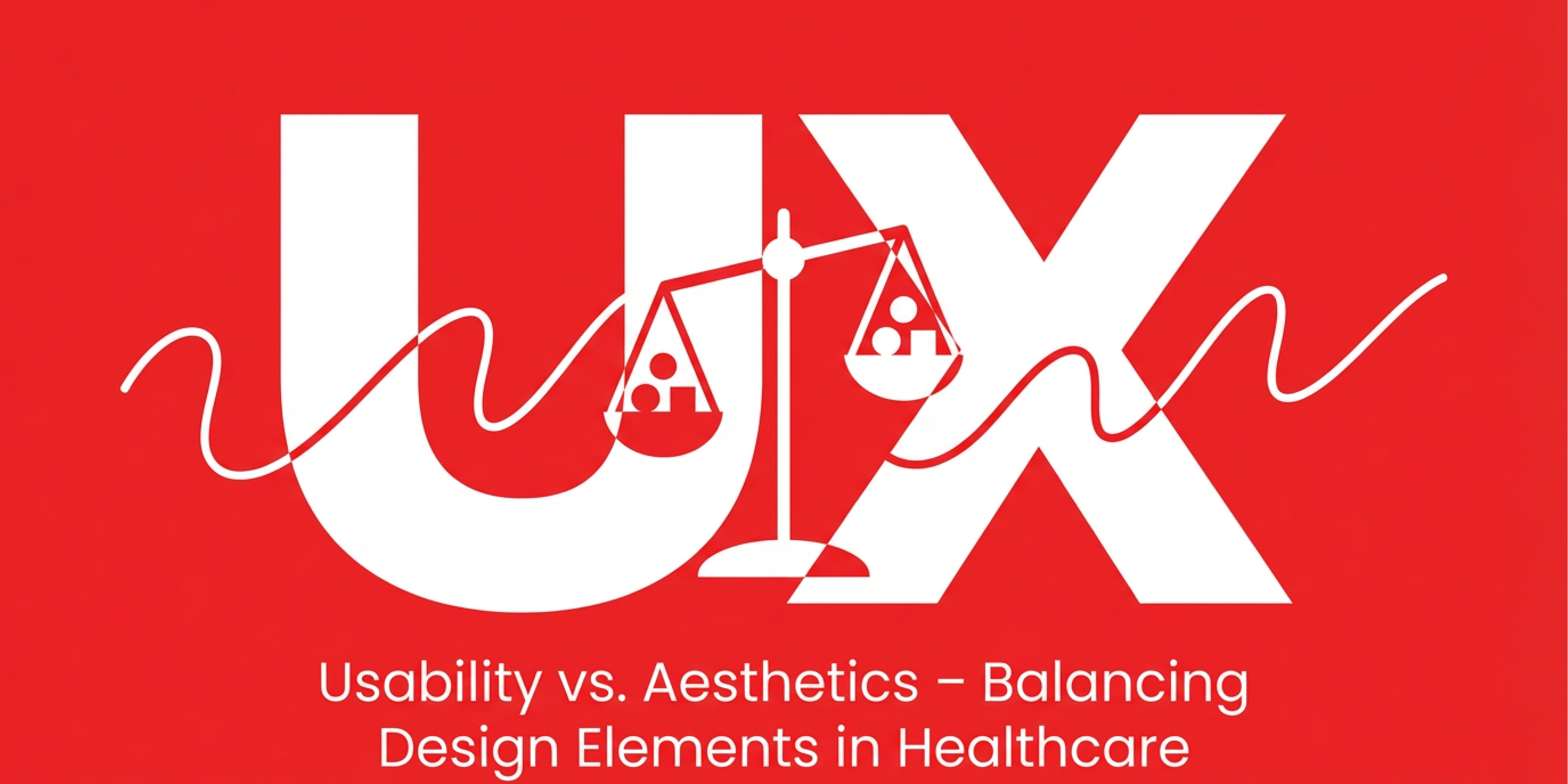
While it’s tempting to focus on making your website, app, or patient portal look visually stunning, usability is key to ensuring a seamless experience for patients. When it comes to healthcare, finding the right balance between usability and aesthetics is critical for both patient satisfaction and functionality. But how do you strike that balance?
In this blog, we’ll explore how to create designs that are not only visually appealing but also highly usable, ensuring your healthcare services meet patient needs effectively.
Why Usability Matters in Healthcare Design
Healthcare users—whether patients, doctors, or administrative staff—need to be able to navigate digital interfaces quickly and intuitively. Usability ensures that your digital products are easy to use, helping people find the information they need without frustration or confusion.
- Patient-Friendly Navigation: Healthcare websites and apps need intuitive layouts that guide users to the right information effortlessly, such as booking appointments, accessing medical records, or finding a doctor.
- Accessibility: Digital healthcare platforms must be accessible to all, including those with visual or physical impairments. This means clear fonts, high contrast, and compatibility with screen readers or other assistive technologies.
- Streamlined Workflows: For healthcare professionals, usability ensures efficiency. Clunky interfaces slow down care, while well-designed systems streamline workflows, reducing administrative burdens and human errors.
In a field where time and accuracy are paramount, usability can make a significant difference.
The Role of Aesthetics in Healthcare Design
Aesthetics aren’t just about making something look nice—they influence how patients and users feel about your brand and the care you provide. In healthcare, a well-designed, aesthetically pleasing interface can inspire trust, calmness, and professionalism.
- Trustworthiness: Clean, modern designs give patients confidence in your capabilities. A poorly designed website might give the impression that your practice isn’t up-to-date or trustworthy.
- Comfort: Aesthetic choices such as soothing color palettes, whitespace, and comforting imagery can reduce anxiety in patients. The right visual elements can create a more welcoming experience, especially in stressful healthcare situations.
- Brand Perception: Your design choices impact how patients perceive your healthcare organization. A polished, professional design builds a stronger brand presence and communicates the quality of care you deliver.
While aesthetics may not directly impact the usability of an interface, they certainly contribute to a better overall user experience by fostering trust and comfort.
How to Balance Usability and Aesthetics in Healthcare
Balancing usability and aesthetics is about ensuring your healthcare platform looks good without sacrificing functionality. Here are a few tips to help you strike that perfect balance:
1. Prioritize User Needs Over Visual Appeal
First and foremost, design your interface with users in mind. Focus on making navigation and interaction easy, especially for patients who may be unfamiliar with digital healthcare tools. Usability should always come first:
- Use clear and legible fonts to avoid frustration.
- Keep the layout simple and declutter unnecessary elements.
- Ensure that important features like appointment scheduling or patient portals are front and center.
2. Incorporate Visual Elements that Enhance Usability
Aesthetics should complement the functionality of the interface. Choose design elements that guide the user through their journey, rather than overwhelming them with visual complexity. Examples include:
- Using colors and icons to highlight critical actions or notifications.
- Incorporating whitespace to reduce cognitive overload and create a cleaner, more focused experience.
- Employing consistent design elements like button styles and navigation to provide familiarity across pages.
3. Test for Accessibility
Ensuring that your design is accessible to all users is critical in healthcare, where diverse patients may need to interact with your system. Test your designs with real users to understand how easy they are to navigate, especially for those with impairments:
- Make sure your website or app is compatible with screen readers and other assistive devices.
- Ensure color contrast meets accessibility standards for visually impaired users.
- Include alt-text on images for those who use screen readers.
4. Focus on Mobile Usability
With a growing number of patients accessing healthcare services via mobile devices, designing with mobile users in mind is non-negotiable. Ensure your design is responsive and offers a streamlined mobile experience:
- Use touch-friendly buttons and easily scrollable content.
- Ensure that forms and portals load quickly on mobile devices.
- Test how well the aesthetics translate to a smaller screen without compromising usability.
5. Iterate Based on Feedback
To truly balance usability and aesthetics, gather feedback from your users—both patients and healthcare professionals—and iterate on your design accordingly. This ensures that your platform not only looks good but functions well in real-world scenarios:
- Conduct usability tests and track common issues.
- Regularly update the design to fix any bugs, navigation difficulties, or aesthetic inconsistencies.
Conclusion: The Right Balance Drives Patient Satisfaction
In healthcare, usability and aesthetics are both essential in creating a successful digital experience. By prioritizing ease of use without sacrificing visual appeal, your platform can build patient trust, foster engagement, and help healthcare providers deliver services more efficiently.
Ready to elevate your healthcare platform's design? Contact RLVNT Studios today to find out how we can help you create a balance between usability and aesthetics that works for your patients.
S.V.A.X. signing off ⚡


